
Are you looking for ways to increase website engagement and grow your online presence? If so, you should consider focusing on mobile friendliness. Nowadays, more than half of all internet traffic is coming from mobile devices – a number that is expected to continue its rise in years to come. Therefore, it’s essential to ensure that your website is optimised for these platforms – after all, if users can’t navigate or read content easily when accessing via their device of choice, chances are they aren’t going to stay on your site. In this blog post, we will discuss how making your website mobile-friendly can increase your website’s growth.
The rise in mobile device usage has led to a significant shift in consumer behaviour. People now rely on their smartphones and tablets to access information, make purchases, and interact with brands online. As a result, websites that are optimised for mobile devices have a huge advantage over those that are not.
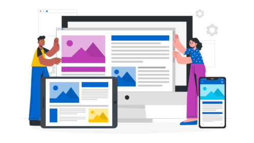
One of the primary advantages of an optimised mobile-friendly website is its better user experience. When a website is designed to be responsive and work seamlessly on different screen sizes, it enhances the overall browsing experience. Users can easily navigate through the site, view content, and complete actions without any frustration or difficulty. This positive user experience leads to increased engagement and a higher likelihood of conversions.
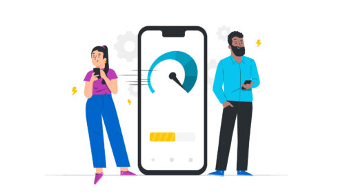
Another advantage of having a mobile-friendly website is better search engine ranking. In 2015, Google announced they would prioritise responsive websites in their search results. This means that if your website is not optimised for mobile devices, it may rank lower in search engine results pages (SERPs).
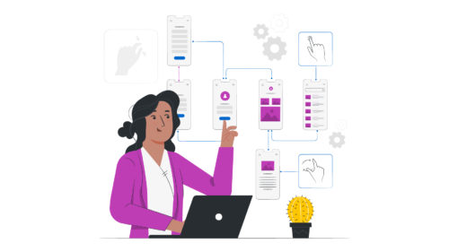
Below are the key elements of how to make a mobile-friendly site:
Interested in a web development project? At Supersonic Playground we provide an eclectic range of development services designed to help businesses establish themselves within the digital space. Get in touch with a member of our team here.


Our friendly team is ready to help you bring your vision to life. Whether you’re ready to start your project or just want to discuss your options, we’d love to hear from you.