“Design is so simple. That’s why it’s so complicated” – Paul Rand
Visual design is just one of the many stages of the website design and development process. However, with studies showing that you have only 50 milliseconds before users make their first judgements, it’s also one of the most important.
WordPress design is not just about making things look pretty. It’s about communicating your brand values and your core offering to your target audience. It’s also about creating a visual style designed to resonate with your specific target market.
Visitors to your website will often make up their minds about whether they like your brand and want to buy your products or services very quickly. Typically, these decisions are made on a subconscious and emotional level, so the individual may not even be able to explain why they feel a certain way about your brand or website. It’s therefore vital your design communicates the right things from the moment a user lands on your site, so your website’s design needs to be carefully thought out to develop the proper emotional connection, which could be trust, credibility, or familiarity.
The cliché first impressions count is often used to describe the importance of aesthetics. Typically, this can be the difference between someone choosing your business over one of your competitors. If your website isn’t visually pleasing to your audience, then it doesn’t matter what great features you have, how relevant your content is or even what you’re selling.
When we’re talking to potential clients, we often describe the importance of visual design and its impact using two very different ‘spirals of perception’:
Suppose a potential customer lands on your website, and it appears outdated, low quality or cheap. They’ll ask themselves why you haven’t invested in good quality, well-designed website. Is it because you haven’t got enough money to invest? If so, does this mean your business isn’t doing well? If your business isn’t doing well, does this mean that other people aren’t using you? If so, why aren’t they using you? Is it because you’re not very good at what you do or are unreliable? The ultimate conclusion they will draw is that if you’re not very good at what you do and other people aren’t using you, why would they risk using you? This may all sound superficial and harsh, but quite often, a website is the only contact a potential customer will have when trying to choose a supplier. Therefore, they will, understandably, be cautious about whom they choose to spend their hard-earned money with.
On the flip side, the upwards spiral causes the opposite reaction. If a visitor lands on your website and sees that you’ve invested in a clean, crisp, modern, up-to-date website that resonates with them, they will assume you have the money to invest in a good quality site. Therefore, this must mean that your business is doing well, and if your business is doing well, then this must be because other people are using you. If other people are using you, you must be good and what you do, and, most importantly, people feel they can trust you.
It’s well accepted that social proof is an important part of the decision-making process. Still, social proof isn’t always as direct or evident as a word-of-mouth recommendation or testimonial. Those things are important too, but these spirals of perception demonstrate that social proof can be achieved via the halo effect, whereby a business’ website reflects how well it performs.
Good visual design can be broken down into several key components, including:
Typeface
Different typefaces create different impressions, and there are specific types of fonts designed for different situations. Successful brands use them to create impressions based on what they are trying to communicate with their user. For instance, some supermarket chains use ‘humanist’ typefaces to create a warm, friendly feel, as certain parts of these typefaces are designed to echo the way we write.
Colours
A huge amount of research has been done into how different colours affect an individual’s psychology. Successful brands choose their primary colours based on which emotion they are trying to convey. For example:
White or ‘negative’ space
This refers to how busy or cluttered versus how to open or spacious a visual design or layout feels. White space is usually associated with more premium brands, and this harks back to the days of print purchasing when brands would pay by square-inch for their advertisements. Low budget brands with tight budgets who sold on price would try to squeeze everything into a small space. They would have to shout more to stand out amongst their competitors. In contrast, premium retailers whose products were of high enough quality to sell themselves would use lots of open space to differentiate themselves and to show quality and luxury.
Quality websites aim to marry excellent user experience, visual design and technical development. While a good visual design can mask a poor functioning site, no matter how well your site is developed, users won’t like it if it’s not aesthetically pleasing.
As a business owner or marketer, it can be challenging for you or anyone on your team to assess your website without being biased, especially if you or your team were involved in its initial creation. We recommend getting a second opinion from outside eyes, ideally your customers but anyone who can give you a fair, unbiased and objective appraisal. Here are a couple of ways to find out if your visual design is working:
Below we’ve included some scenarios to help you understand the importance of visual design and how it could transform your offering.
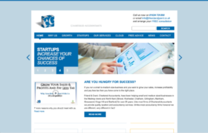
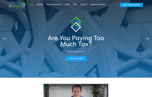
Imagine you’re looking for an accountancy firm to support your business. Which of these two would you choose to work with? The first example or the second?
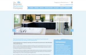
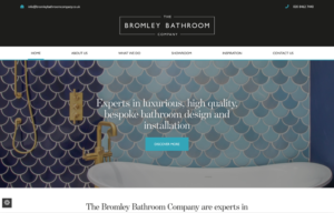
Imagine you’re looking to spend around £10k – £15k on a premium new bathroom. Which out of these two businesses would you choose to work with? The first or the second?
Imagine you’re looking for a Cyber Security business to support your company. Which would you choose, the first example or the second, and why?
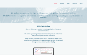
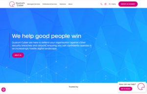
We’re almost certain you would have chosen the second one every time. Each of the sites shown above are the before and after screenshots of real-world projects that we’ve recently worked on. While we may be a little biased, we think these are great examples of how branding and visual design can completely change how a business resonates with users.
If you’d like to learn more about how our team could help give your website a visual refresh, please get in touch. Or, to stay in the loop with our weekly insights, register for our newsletter.


Our friendly team is ready to help you bring your vision to life. Whether you’re ready to start your project or just want to discuss your options, we’d love to hear from you.